Creating input fields
You can create input fields of the following response types:
| Response Type | Description |
|---|---|
| Check box | Example: Say a new joinee can be a full-time or part-time employee. Therefore, you can add an input of type check box as Full-Time Employee. |
| Date | Example: HR executive must provide the date of joining of the new joinee. |
| Date/Time | Your clients cannot select time as input in the BMC Remedyforce Self Service mobile application. Note: The value stored in this field does not change as per the time zone of the user viewing the submitted service request. |
| Header Section | Header section enables you to group multiple fields under a section. The header section spans across columns on the service request form. Select this check box only if you are using Self Service 2.0. If you are using Self Service 1.0, the UI gives a distorted view. |
| Lookup | If you want clients to select a value from records of an object, use the response type Lookup. You can also add a criteria to show filtered records. |
| Number | Example: Say for the new joinee, the HR executive must provide the cost center number. |
| Picklist | Example: While raising a request for a new hire, an HR executive must provide the employee location. If your company has multiple locations, you can add a picklist input type with Input/Prompt as Location. The displayed and stored values can be New York, Chicago, Dallas, Miami, and India. |
| Radio Button | Example: For a new employee, IT department must know what type of computer must be issued to the new employee. In this case, you can add the radio button response type with Input/Prompt value as Computer type. The displayed and stored values can be Desktop or Laptop. The steps to add a radio button are same the steps to add picklist options. |
| Text Area | Enables your clients to enter a combination of letters and numbers. |
| Text Area (Rich) | When you are adding an input field of type, Text Area (Rich) consider the following important points:
|
| Text Field | Enables your clients to enter up to 255 characters in separate lines. |
Note
If you delete any input type field from an SRD, that field continues to display in existing service requests. However, these deleted input fields might not appear at the same position they appeared before deleting the fields.
Header Section
To control how the header section is displayed on the service request, you can select any of the following separators:
- None—By default, no separator is selected for the header section.
- Line—Select this separator to display a line above the header section.
- Bar—Select this separator to display the header section as a bar.
After creating a Header Section input field and the other input fields that appear under the Header Section input field, you can select these input fields and click the up arrow or the down arrow to modify the position of the input fields in the display order of the request definition.
For example, you create a Header Section input field with the following Input/Prompt text:
Select the type of accessories that you want to request:
After creating this input field, create check boxes for each accessory that is available in your stock, such as Monitor, Keyboard, Mouse, or Headphones.
These Input fields are grouped in the service request as: 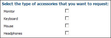
All the fields that you add after a Header Section input field are arranged under the same header until you add another field of type Header Section.
Note
If you delete a Header Section type input field, it is not displayed in existing service requests.
Lookup
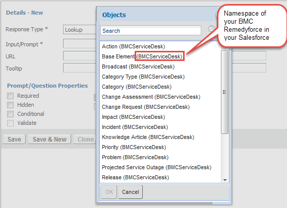
When you select Lookup as a Response Type, a second list appears next to the Response Type list. In the second list, you can select the object whose records you want the client to select in the service request. You can define lookup fields for various objects like Action, Base Element, and so on. For example, you can add a field of type Lookup to the Category object to enable clients to select a sub-category of the service request. For this example, you can add an input field, Sub-category, of type Lookup on the Category object.
You can identify the application to which the object belongs to from the namespace that is shown with the object name. By default, the Lookup window displays the Name field of the object.
Ensure that clients have at least Read permission for the object whose Lookup field you are adding.
Note
The Lookup list and the Search results displays only 200 records at a time.
You can also configure criteria to show filtered records in the Lookup type input fields. Before you create filters, see Considerations for creating lookup filters for request definitions.
Considerations for creating lookup filters for service request definitions
Before you create filters, you must review the following points to understand how the lookup filters are implemented in SRDs:
The default filter criteria applied to Lookup type Input fields cannot be removed from the
Incidentobject. The lookup filters that you create are applied in addition to the default filter criteria.- If the filter that you create for a Lookup field conflicts with the default filter criteria, no results are shown in the Lookup window.
- For the Category Lookup field, if a child category meets the specified filter criteria but its parent category does not meet the filter criteria, both the parent and the child categories are not shown in the Category lookup window.
- If you define a filter criterion on a Date/Time field type by using the =, !=, <=, <, >, or >= operator but do not specify a field value, the date/time when the form was opened is considered as the default field value.
- If you define a filter criterion on a Number, Currency, or Percent field type by using the =, !=, <=, <, >, or >= operator but do not specify a field value, 0 (zero) is considered as the default field value.
Creating filters for the values shown in the lookup field
- From the Response Type list, select Lookup.
- From the next list, select the object for which you want to create the lookup.
- From the list of lookup filter options, either select New Lookup Filter to create a new filter or select Existing Lookup Filter to use an existing lookup filter.
- In the Filter Name field, enter the name of the filter.
From the Filter Type list, select the appropriate option:
Required—To show only the filtered records in the Lookup window. Users are not able to view all records.
Optional—To enable users to view all records. When the Lookup window opens for the first time, only filtered records are shown. To see all records, users can click Show All Results.
- From the Filter For list, select the required field.
From the Operator list, select the required operator.
The operators shown in the list are based on the selected field type.Based on the option you selected for the field value, type or select the appropriate value as shown in the following table:
Selected field type Example Field Value to be defined Checkbox ServiceDesk Staff TRUE or FALSE Date/Time Created Date Select a specific date from the calendar. Text Email Signature Enter the appropriate value in the text box. Picklist/Lookup Category Select the appropriate option. Click Add.
Click Save.
If you edit an existing lookup filter that is also applied to another Lookup type Input field, you can either save the lookup filter as a new lookup filter or replace the existing lookup filter.
Configuring fields to be displayed as columns in the Lookup windows
To configure additional fields to be displayed as columns in the Lookup windows, configure the fields in the Column Headers field set of the object. By default, for some objects like Incident, Change Requests, Tasks, and so on, the Column Headers field set is provided by default.
- Click the Remedyforce Administration tab.
- On the Home page, click the Manage Objects tile, and from the menu, select Create and Edit Objects.
- On the Create and Edit Objects page, from the Object list,select the required object or click All Custom Objects and then click the object name.
- In the Field Sets section, click Edit for the Column Headers field set.
If the Column Headers field set does not exist, perform the following steps:- In the Field Sets section, click New.
- In the Field Set Label field, enter Column Headers.
In the Field Set Name field, enter LinkRecords.
Note
For the Field Set Name field, you need to enter LinkRecords. Only then the fields which are configured in the field set are displayed for the Lookup window.
- In the Where is this used? field, enter the required description about the field set.
- Click Save.
For more information about field sets, see Salesforce Help.
- Drag the fields that you want to show in the Lookup window to the In the Field Set list.
- Click Save.
Ensure that the ServiceDesk Client profile has Visible field-level security for the fields that you add to the Column Headers field set.
Picklist
The number of picklist options that you can add depends on the length of the displayed and stored values of each option. For example, you can add approximately 500 options of 40 characters each (inclusive of the displayed value and the stored value). The number of options can be higher if the picklist items have smaller displayed and stored values.
To add a picklist response type
- In the Response Type list, select Picklist.
Press Enter after every value to ensure that each picklist option is added in a new line. - In the Picklist Values section, add values in the "<Displayed Value>","<Stored Value>" format.
The displayed value is shown to clients in Self Service and the stored value is stored in the application.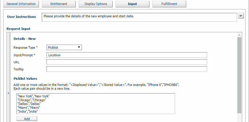
- Click Add.
- If you want the picklist value to be selected by default, select the check box in the Default Value column.
- (Optional) After adding a picklist option, perform any of the following actions:
- To move a picklist option (up or down), select the option, and use the up or down arrow.
- To sort picklist options, click
 .
. - To update a picklist option, select the option, modify the value, and click Update.
- To update all picklist options, click
 .
. - To delete a picklist option, select the picklist option, and click
 .
.
- Click Save.
The following figure shows the picklist values in Self Service: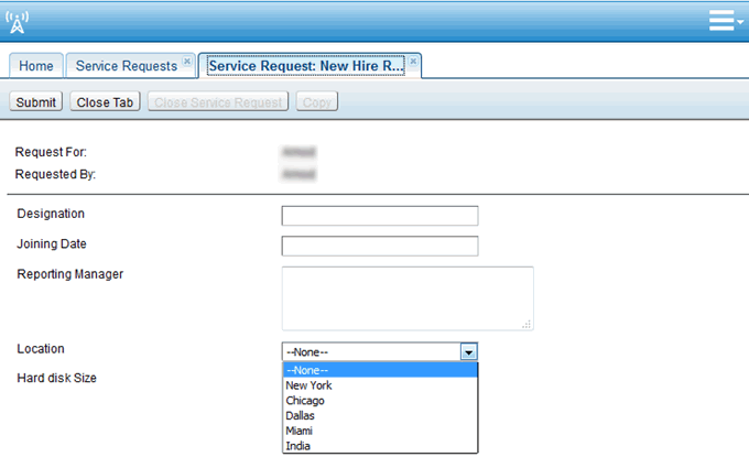
Radio button
When you select Radio Button as the Response Type option for an Input field on the Fulfillment tab of an SRD, you need to add the radio button options from which the users can select an option.
For example, for a new employee, IT department must know what type of computer must be issued to the new employee. In this case, you can add the radio button response type with Input/Prompt value as Computer type. The displayed and stored values can be Desktop or Laptop.
To add radio button options to the service request
- In the Response Type list, select Radio Button.
When you select Radio Button as the field type, the Radio Button Value section appears. - Add values in the "<Displayed Value>","<Stored Value>" format.
Press Enter after every value to ensure that each option is added in a new line. The displayed value is shown to clients in Self Service and stored value is stored in the application. - Click Add.
The displayed value and stored value of the radio button options are added to the list. - If you want the radio button option to be selected by default, select the check box in the Default Value column.
- (Optional) After adding a radio button option, perform any of the following actions:
- To move a radio button option (up or down), select the option, and use the up or down arrow.
- To sort radio button options, click .
- To update a radio button option, select the option, modify the value, and click Update.
- To update all radio button options, click .
- To delete a radio button option, select the option, and click .
- Click Save.
The following figure shows the radio button options in Self Service:
Note
If you delete a Header Section type input field, it is not displayed in existing service requests. However, if you delete any other input type field from an SRD, it is displayed in the existing service requests. These deleted input fields might not appear at the same position they were before deleting the input type field.
If you delete any input type field (other than a Header Section type input field) from an SRD, that field continues to display in existing service requests. However, these deleted input fields might not appear at the same position they appeared in before deleting that field.
Comments
Log in or register to comment.