Configuring the Summary table template
Use the Summary table template to display summary data in a tabular format in a custom view.
You can use this template to show a summary of elements based on the selected data and filters. For example, to provide a summary of the number of clusters, hosts, and virtual machines managed by a selected server.
To configure a view using the Summary table template
The following video (3:44) illustrates the process of creating a summary table in a custom view by using the Summary table template.
Information
This video describes the functionality of TrueSight Capacity Optimization, but it is valid for BMC Helix Continuous Optimization too.
Open the view page with the Summary table template:
- For a new view, add a view and select Summary table as the template. For detailed steps, see Adding and managing views .
- For a new page in an existing view, add a page and select Summary table as the template. For detailed steps, see To add a page to an existing custom view.
- In the view page, specify the following information:
- Title: Type a title for the page.
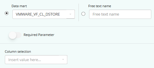
- Data mart: Select an existing data mart from the list to show data on the page.
If the required data mart is not listed, you can also add a new data mart or edit an existing data mart according to your requirements.- Clicking Add Data Mart takes you to the Add Summary Data Mart wizard that allows you to build a custom data mart according to your requirements. For details, see Creating a summary data mart for a custom view.
- Clicking Edit Data Mart takes you to the Edit Summary Data Mart wizard that enable you to edit the definition of the selected data mart. In this wizard, the links in the right panel are clickable. You can click the page that includes the options that you want to edit. For example, to edit the time filter options, click the Time Filter link in the right panel, and make the necessary modifications. You can edit only data marts that are created using the Add Data Mart wizard.
Add filter: You can add the filter using one of the following configurations:
Basic configuration: Select a column from the drop-down list. The list displays the columns from the data mart that you selected in the previous step (primary data mart).
Advanced configuration: Click the Advanced link. You can configure one of the following settings:
Data mart: Select this option to add a filter with a column from a different data mart than the primary data mart. By default, the primary data mart is displayed. You can also mark this filter as required to restrict the data to be displayed automatically in the view.
In the custom view, the required filter is denoted by an asterisk. If you have configured multiple filters and at least one of them is the required filter, the data is not displayed unless you select the values for all required filters.Free text name: Select this option to add a filter with a free text and provide the following values:
Name for the free text. It is recommended to use the custom filter macro while creating the primary data mart and use the free text name as the parameter ID. For more information, see Creating a SQL-based data mart for a custom view and Using filter macros with SQL queries.
Label, description, and size of the free text input filed that is displayed for this filter in the view.
Consider that you have configured three filters and filter 2 (Entid) is a required filter.
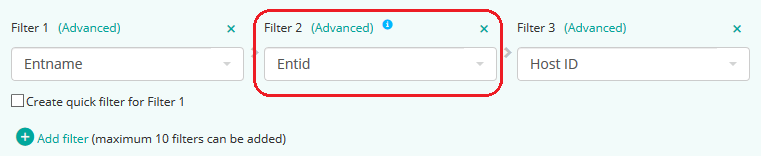
The output of the custom view page is as follows. No data is displayed because no value is selected in the Entid filter.

Select a value in the Entid filter. The custom view page displays data. You can also select a value for the Host ID filter.

Because every filter is dependent on the previous filter, when you select a value for the Entname filter, the values in the Entid and Host ID filters get cleared.

Create quick filter for Filter 1: Select the check box to display Filter 1 as a quick filter on the custom view page. All distinct values of Filter 1 are available as clickable buttons. The following figure shows an example of how the quick filter appears on the custom view page:

Hierarchical filters: When selected, the filters follow the hierarchy on the custom view page. Every filter acts as a parent filter for the filter next to it. The data in the view is filtered based on the value selected in filter 1, then by filter 2, filter 3, and so on. When you clear the values in any filter, the values in the dependent filters get cleared.
Information
You can configure a maximum of 20 filters on a page.
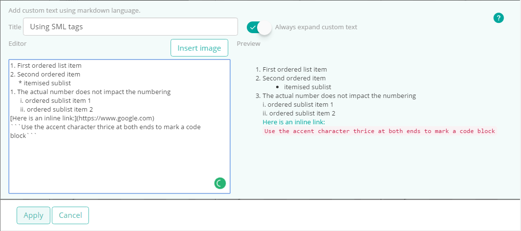
(Optional) To add custom text, click Add custom text. To update an existing custom text, click Change in the custom text panel. You can add descriptions, instructions, links, or any other textual information for the users of the view page. Use markdown tags to format the content of custom text and to add images, links, and tables. For example, add a description such as “Displays performance metrics for Payroll application”, or a label such as "NY Datacenter - Capacity Metrics".
Title: Type the required title for the custom text.
- Always expand custom text: Select to display the custom text as expanded or collapsed.
- Editor: Type the required content and format it by using markdown tags such as * to create an unordered list and # to increase the font size. A preview of the formatted content is displayed in the Preview section.
- Insert image: Enable you to add an image. The selected image is displayed in the Preview section.
The following image illustrates the preview of the commonly-used standard markdown language tags.

For more information about markdown tags, see Showdown's Markdown syntax
 .
.- If you configure multiple tables and want to view two tables side by side, select Double column in the Grid layout toggle button. By default, Single column is selected.
- To configure the columns of the View table, click
 in the table section and complete the following steps:
Type a title for the table.
From the Columns list, select the columns of the data mart to display. The columns list is filtered by the data mart you select.
By default, four columns are displayed. You can also click + Add column to add more columns, or delete a column by clicking X at the top-right of that column.To modify the default column header label, renderer, and column visibility option, select a column, and click the corresponding Edit parameters link to configure it further:
In the Edit <columnName> parameters screen that opens, specify the following options:
If you do not want the column name as appears in the data mart to be displayed as the column header, type a new label in the Column header label field.
Select the Renderer and configure it.
The default renderer is automatically selected based on the data mart column that you select in the previous step. For example, if you select data center (dc_name) as one of the columns, the corresponding default renderer for that column is Text.
Depending on the selected renderer, the parameters to configure differ. For more information about the available renderers, see Renderer options in custom views.
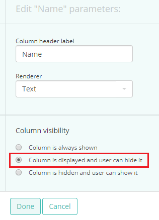
In the Column visibility section, specify whether the column must be shown or hidden on the view page:
Column is always shown: The column is permanently shown. User of the view cannot hide the column.
Column is displayed and user can hide it: The column is shown by default. The user can hide or show it from the Show/Hide columns window.
Column is hidden and the user can show it: The column is hidden by default. The user can choose to show or hide it from the Show/Hide columns window.
As per the following column configuration, the Name column is displayed by default and the capacity view user can hide it.
When the capacity view user opens the configured view page, the Name column is displayed.
The capacity view user can choose to hide the column by selecting the Show/Hide Columns option from the table action menu.In the Show/Hide Columns window, the Name column is displayed, by default. To hide the column, clear the check box and click Save.

The column is not displayed in the table.
After you complete editing parameters for one column, click Done to return to the previous edit screen.
You can continue to edit parameters for other columns.
To reorder the columns, click Reorder columns. Type the required order or position number in the Order field for the required column. The columns rearrange automatically.
Information
You can only enter a number between 1 and the total number of columns in the Order field. For example, if four columns are displayed, then you cannot add an order number greater than 4.
Click Apply. The changes are updated dynamically in the view and you continue to be in the edit mode.
Note
Clicking Apply displays a live preview of your configuration, without saving the changes. This live update helps you to quickly review your changes, and if required, quickly make further changes as you continue to be in the edit mode.
- (Optional) To add multiple tables, click Add table.
- To configure the table, click
 in the table.
 denotes that the display of the table is enabled.
  denotes that the display of the table is disabled. If you disable the display of the table, it is not displayed in the view.
 - Data mart: Select an existing data mart from the list to show data on the page.
- Title: Type a title for the table.
- To configure the columns of this table, perform the steps mentioned in the Step 4.
Click Apply.
Note
You can add maximum 10 tables for the Summary table template view.
- To configure the table, click
- If you are satisfied with your changes, and do not want to edit the view further, click Save.
The custom view page is displayed with the new configuration.
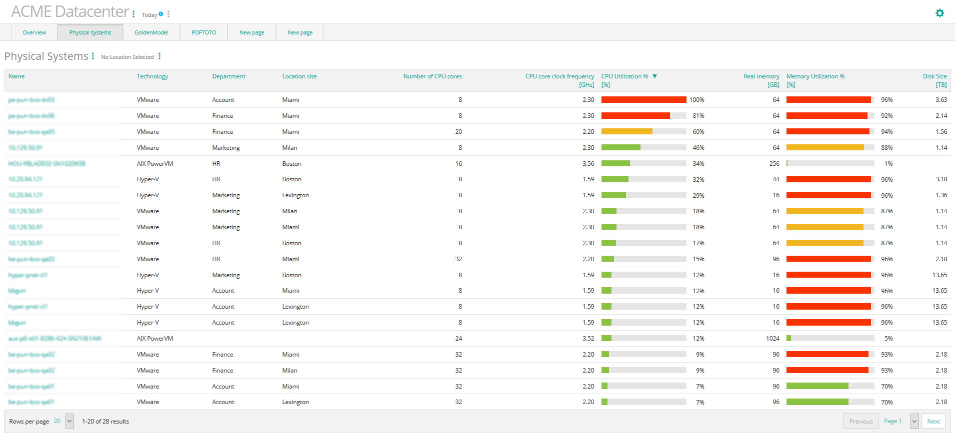
Examples of a view page with the Summary table template
Comments
Log in or register to comment.